Showing posts with label DSDN112_process. Show all posts

Tuesday, 30 October 2012

Project Two: Final Ad


Final Ad:


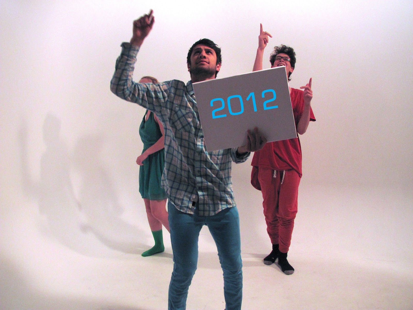
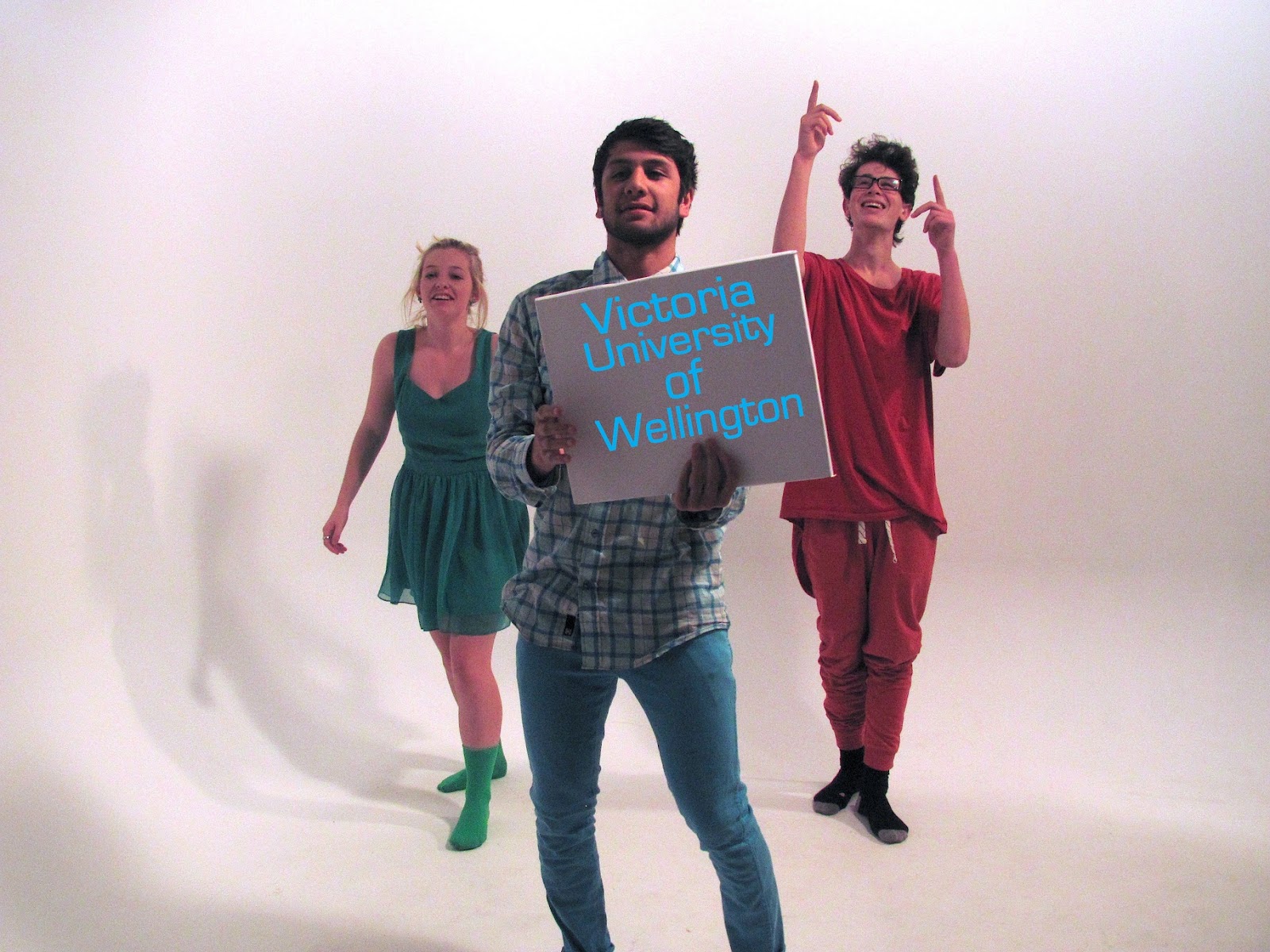
Here is a video of my final ad that I created. Overall I am pretty stoked with it. I decided to keep the speed of the photos quite quick to make it a smooth stop motion. I didn't want it to be too quick though so that you couldn't read the words. I think that I have managed to get the timing and speed right for this. The ad is the length of a normal ad too. It is quite hard to keep up with what is written on the screen but I don't think this matters because when you watch ads anyway it takes you a few times to pick up what it is saying an advertising because it often happens all so quickly. The main thing that I wanted to come out of this ad was that when watched once by the viewers they would clearly remember something ie: the music or the dancing and then therefore may want to look it up later in their own time to find out more. I have included the credits as part of the ad. I have chosen to do this as I didn't like the idea of having an ad with credits as this isn't normal. The credits do go very quickly considering but I only have them their as they are a requirement otherwise I would not have included them in my ad if I didn't need too. Below I have the images that I used with the credits on them to show who has helped and contributed to this project. 


Monday, 29 October 2012

Project Two: Filming The Ad


Below are some images of me filming my Ad. I use the Ergo lab to do the filming. I was lucky enough to have some help from some friends in the hostel and design. I was pretty happy with how smoothly the filming went. I used the lighting to my advantage in the ergo room. It was a huge help being able to change the lighting to how I wanted. I am very pleased with how the coloured clothing came out. I got a very good mixture. It looks very effective. I was also very happy with the dancing by the helpers. They did such an awesome job. I was worried that I wouldn't get to pick it up quick enough when taking photos but it all worked out. It was a lot of fun to film. We even managed to get locked in the room for about 20mins and had to wait for someone to find us. Pretty funny!!!


Tuesday, 23 October 2012

Project Two: Process: Planning And Testing


Test One:


I have done a quick test to see if doing a stop motion would work. Obviously the model will be in the right clothes and it will be filmed in a white room but I just wanted to see if it would work. I think it will I just need to get the transitions more smooth which shouldn't be too hard. I am not too sure what to create it in yet but I am thinking about just doing it in Windows Movie Maker.  


Project Two: Updated Storyboard


Below is an example of how I am wanting to set up the 'stage' for this video. I have decided that I want to film it in a white room. Even if that means just using white sheets. After completing this little diagram I decided that having the other models dancing in the background isn't very relevant so instead I am just going to focus on one model at a time and they can be having a little 'boogie' on the spot. I am going to doit so that once I have finished filming I add in the text afterwards that way the transitions will flow and it dosen;t bother me if it looks like the words are moving. I have also shown examples of the interfaces that i want to come onto the screen right at the end and then maybe have colour dripping from them like how it does in the ipod add. 


Project Two: Process: Content In Video


I have decided to use the idea of having my model holding signs that will have have written on them the key features of my application and a explanation for them. Each model will show a sentence each and their will be one word per page. I have written below what is going to be mentioned through out the video and have put them into their sets.  Underneath I have aslo given some example of what the signs are going to look like. I want them to be quite simple so that they are easy to read. There are 5 colours that I am working with. The model will match one of those colours aswel as their interface on the app.


What puts us ahead of the rest?

On the main menu start off with a ‘quick search’ right at your fingertips

Use the ‘Where am I’ function to locate exactly where you are on campus.

Use one of the many checkpoints around the campus, be standing at least 10 meters away and click the ‘Where am I’ button, within seconds you will be able to see where you are on a map.

Not sure where or what your next class is?

Select the ‘Timetable’ option and choose your next class from it

Choose the multiple floor option to see a map of any floor in any building.

Just scroll through the floors and select the desired one.

Finding your way just got easy..

VUW MAPS


Monday, 22 October 2012

Project Two: Change Of Idea


After thinking about how I am exactly going to approach the filming of my idea. I have decided that it was going to be quite a big job and that to make it easier and more achievable I would simplify my idea. I don't want to have to rely on being able to have access to white rooms and lots of people to be free to help me as I know that I do not have much time and a lot of people are busy with there of projects and exams. So instead of my previous idea I have now decided to do this instead.

Instead of creating a tv ad, I am going to do an interview with some of the people that 'were in' the ad and pretend that the ad has just been finished being filmed. The interview will take place on set where the ad was Taken and different people from the ad will be interviewed about the new app and the ad thats promoting it. I am still going to use the same idea of having the actors dressed up in one colour that matches there interface. I like the idea of having no sound but only music so instead of hearing what the interviewer and actors are saying I would like to use typography and have this coming out of their mouths instead. Something similar to Charlie Chaplin style. I think instead of creating a stop motion I will just film the interview and then go in and edit it by adding the type as it will be very hard to match it up otherwise. Another way I am considering doing this is having the actors answer the questions by holding up signs with their answer on them. This might look abit off though and I am unsure what I would do for the interviewer so I may just not make it an interview and have the actors talking about the app using signs and maybe this could be the ad instead or the after bit.

I still have some decisions to make but I feel much better about my ideas and they feel more achievable.

Sunday, 14 October 2012

Project Two: Video Clip Storyboard Interim


Video Clip: Storyboard :


For this next project I am wanting to create a tv commercial for my video. I am using the Apple iPod Nano Chromatic 2nd generation commercial as a key influence to the making and aesthetics of the video. I have chosen to use the commercial as a influence in my work as I like how they made the user wear all one colour that matched their ipod. This made the ipod more personal to the user. I am wanting to do the same thing in my video. I also like how apple just focused on the feature that made this ipod different from the rest. I have chosen to do the same with my video. Hopefully It isn't too hard to create and I am not yet sure if I am going to just film it or create a stop motion. I shall see what is easier. 

Tuesday, 9 October 2012

Project Two: Video Clip: Inspiration


For the second part of project two I really have no idea of what it is that I want to achieve and how I want to do my video. After seeing some examples in the lecture it made me realize exactly what we could do and that we could pretty much do anything. To get me thinking I have found some example of stop motions, commercials and advertisements of some popular products. Each youtube video below has got me thinking about how I can use a similar method in my own video and also how I might be able to incorporate them all into one.


The Original Human Tetris: Guillaume Reymond:


This is so well done. Look how realistic it seems. Great inspiration right there. 


#2 iPod Touch: Music Is My Hot Sex:


I like this commercial of the ipod touch because its covers all the best features of the product and shows them in a sufficient way. You really understand what it is you would be buying by the time you reach the end of the commercial.


New iPod Nano Commercial: Apple Inc:


This is another all time fave commercial that apple has done for the ipod. I love how the user is shown interacting with the product and they look like they belong together as the are both the same colour. The soundtrack that has been used keeps you interested in what is happening. I also really like how they just focused on the features that makes this ipod different from the rest eg: the camera. 


TomTom: GO 1000 Series Guided Tour:


I found this youtube video as an example mainly because it is of a gps and I was curious to see how companies had previously advertised and promoted their gps devices. Personally I don't think it is very interesting but how ever it is very informative and really does cover every little detail of the product. I just found it very lengthy and hard to watch as it was basically just a whole lot of information spoken to you.


I think at the moment I would quite like to have a video that doesn't have much talking like the apple commercials and incorporates the user interacting with the app as well as using typography in an innovative way to show off my app.  


Thursday, 4 October 2012

Project Two: Five Images


Below are five images showing the keys stages and features of my interface

1:


2:


3:


4:


5:


Project Two: 200 Words


VUW MAPS

Finding your way just got easy..

VUW Maps is a new navigation application designed to help users get around Kelburn campus. With its colour coding and simple layout VUW Maps is an easy application that can be used by anyone. VUW Maps has a number of features to make your navigating around campus that much more easier. On the main menu start off with a ‘quick search’ right at your fingertips or use the ‘Where am I’ function to locate exactly where you are on campus. Find one of the many checkpoints around the campus, be standing at least 10 meters away and click the ‘Where am I’ button, within seconds you will be able to see where you are on a map. Not sure where your next class is? VUW Maps has it covered. Select the ‘Timetable’ option and choose your next class from it and away you go. With written instructions and estimate time for each step there is no chance of being late to your next class/ appointment. More of a visual person? Choosing the multiple floor option allows you to see a map of any floor in any building. Just scroll through the floors and select the desired one. The floor that you are currently on will always be highlighted in pink.  

Monday, 1 October 2012

Project Two: Paths Shown In Flash


Final Paths Shown In Flash Application:


Above is an image illustrating the final paths that are I have chosen to show in my Flash application. Only these buttons will do something when using my flash application. I have chosen to do it this way to make it easier and just focus on the key features of my application. I really wanted the timetable and multiple floor view actions to be the things that I focused on. However I have showed an example of changing one of the setting options just to give an idea of how easy it is to do and what the steps would look like for changing something in the settings menu. Apart from this my main paths are using the timetable and multiple floor stack view to get from one building to another. Hopefully this diagram will help direct the user as to which button to press and the order to go into. I would have liked to have made a fully functioning application but this would have required a lot more screens and code and I don't think I could have accomplished it in time. However my wireframe from earlier on shows in detail  all the options that would exist if this was to be made and sold.  

Tuesday, 25 September 2012

Project Two: Refining Navigation Interface


In todays lecture we went through ways to make sure that our interfaces were going to be successful in there design. Angela mentioned a few things in which we should consider which were; layout, colour, typography, text, size and font choice. We were given a couple of useful websites to check out if we were wanting some help or inspiration which this. Just for some inspiration I had a look at the website www.wefeelfine.org which was was she showed us. This is such an awesome website. Clicking on the images will link you to the websites.


We Feel Fine Website:

www.wefeelfine.org


The thing I really love about this is the use of colour and interaction. Each dot represents something different and when you hover over one dot a cluster of dots will come together to show that there is something similar about them. I think this is a really fun way of getting the user involved and having them interacting with whats on their screen. This isn't something which I would like to use in my own navigation system but I definitely  find it inspirational. 


Developer.Android Website

http://developer.android.com


This website has been so helpful when coming to refine my layout and overall aesthetic for my interface. Some of the things that I have found useful and want to apply to my designs are the text size, font and colour themes that they have mentioned. I think that they are really good guidelines and using the suggestions that they have made will help my interface look all that much more professional in the long run. They have covered the basics, essentials and the nitty gritty in this website. It has definitely made me re think some of the choices that I made regarding my design. 

Something I am not to sure if I want to do or not is just use icons, just use text or use a combination as my main tabs. I think I will do a demo of both and see what I think looks better as well as see what feedback I get form my peers. I am still yet to track down floor maps of the buildings at Victoria University but if need be I will make my own from scratch. 


Thursday, 20 September 2012

Project Two: Interim Hand-in Reflection


In todays Interim presentation I was actually surprised to see that not very many people had done very much. I was worried that I did a bad job. I am feeling much better amount what I have now and am glad that I put the time into it as it means less work later on. After Hearing some of the feedback and seeing how my paper proto type looked printed out I have done some reflecting and there are a few things which I want to change for the final flash. These changes are:

- I am going to get rid of the 'Store' button I don't feel that this is necessary and instead I am going just going to have the three buttons Navigate, Where am I? and Settings.
- When I list the different floors within a building and put instructions underneath I am going to have a little arrow between the two which will indicate that the user can change the size of the instructions etc to what suits them by dragging the section up or down. 
- I am thinking about changing the colour pallet that I use and the overall aesthetic. I am yet to decide on this though and want to do a few tests first. 
- I also want to go up to Kelburn campus and try and get maps for each floor within a building which I can then use to replace the maps I have at the moment . I want to do this so that it is more realistic and visually makes more sense.

Overall I am feeling pretty good about this project and I am happy with the positive feedback that I got back today when presenting.

Project Two: Interim Hand-in Paper Prototype


Below is images of my paper prototype. I have 15 different screens. There is an example of how they are to be read in the first image. Overall I am pretty happy with my idea but there are a few things that got drawn to my attention while creating these. I don't want to carry on with this aesthetic at this stage but this is something I am going to do some more research into and do some trials of. Apart from that I plan to stick with the bulk of what I have done and shown here. 


Project Two: Interim Hand-in Wire Frame


Here is an image of the wire frame I came up with. I have tried to cover all the possible buttons in my application. It was quite hard to make sure that I covered it all but I think I have managed too. 

Monday, 17 September 2012

Project Two: Final idea


In todays studio I worked through some of the ideas I had thought of for this project with the tutor and I have finally settled on an idea. I have incorporated several of the ideas that I brainstormed and put them together. Below is a brainstorm I did in class outlining the basics of my idea. I am feeling much better about this project now that I have some idea of what I am doing. I think once I start making the actual app in flash I will enjoy this project alot more. Now to start the wire frame and paper prototype thats due Friday!!


Here is a map of Kelburn campus that I have found to help me with giving directions.
I have highlighted a path in red of what I am going to show on my navigation system.


Sunday, 16 September 2012

Project Two: Studio Three Reflection


In todays studio we all shared our ideas that we had come up with so far for this next project. Everyones ideas were quite similar and we all seem to be struggling with the same thing of coming up with something original. I am still unsure of what I would like to do for this project and with not much time left till interim presentation I really need to think of something. During the lesson I wrote down a couple more ideas that I had thought of. The ideas were:

1.  Using your student id to swipe at one of the many check points around the campus to detect where you are. This information would then get sent to your email which is linked to an application that allows you to see a map of where you are. You then put in where you want to go and a map with directions will come up. Basically the student id is used to identify your where abouts on the campus. 

2. Having a watch or piece of jewelry that you use to project an arrow in front of you which shows you where to go. The watch/ jewelry projects according to what you have searched for on your phone or perhaps the search device is part of the jewelry too. 

I am hoping that by the end of Mondays lesson I will have a basic idea locked in so that I can start planning out my wireframe and paper prototype. It would be nice to use my actual idea for the interim rather than just making up something to hand-in and then change it afterwards.

During this lesson we also got taught the very basics of what we need to know how to do on flash. I feel pretty good about and think that I can manage the basics. I managed to do the practice one by myself with out needing any extra assistance. Its just getting an idea now!!!

Tuesday, 11 September 2012

Project Two: Colour Coding And Other Research


While brainstorming some concepts for this project I came across the idea of using colour coding. This is something which I would quite like to use when designing my application. Below is a image showing three examples of how colour coding can work. Colour coding keeps the image well structured and together as well as making it easy to follow. Too much detail sometimes is distracting and takes you off focus from what you are wanting as well as sometimes it can just make the task more confusing. I think colour coding is a way to restrict this from happening. 


Another feature which I think could be useful to have available in a navigation app is being able to see multiple floors at one time on the same screen. This would me that instead of just having written directions to a specific room at Kelburn campus, the user would be able to open up a map of a specific building and find out exactly where they are needed to go using the views of the different floors. It shouldn't be assumed that the users know what floor they are on if there is a choice or know that for example  LT KK101 means lecture theater, floor one, room one. Or can we assume this? Below is an image showing three examples of multiple views being displayed on the one screen. This is what I am referring to but instead of having mulitple views I would replace it for the different floors in the building.